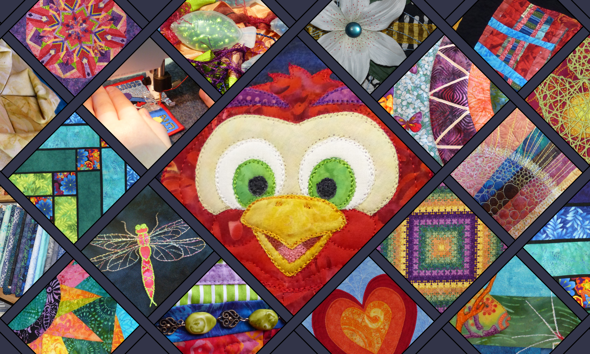
Colour Inspiration Tuesday – explore with me the endless possibilities of colour for our quilts!
Welcome back to Tuesday! We made it! This past weekend we had a family celebration with my father turning 70, so blogging has had a backseat for a few days. But here we are, on the right day, and more or less on time! Yay!
Colour Inspiration Tuesday: Dancing Macaw
About the time I started the Clever Chameleon blog, I also started experimenting with free-motion appliqué. Free-motion appliqué was the homework of my very first Sweet Sixteen monthly meeting. During this time I drew up a number of critters I thought I would like to turn into appliqué designs. One of these fellows was this guy – a cheeky version of a dancing macaw. Macaws are magnificently beautiful, don’t you think?!
Dancing Macaw appliqué design in progress.
Needless to say though, learning to blog has been even more intensive than I expected, and I haven’t yet got back to developing many of the designs into patterns. (Some owls are an exception, more on that another day soon! And I did do a pelican quilt – do you remember him?). Anyway, when I found a photo of a blue and gold macaw on Unsplash.com, I knew I had to do a “Dancing Macaw” colour board.
The “Dancing Macaw” colour scheme is gold and blue. It is a beautiful example of blue and orange-yellow together. You’ll be hard pressed to go wrong with these colours on a quilt because they are complementary and therefore very eye-catching.
The only downside is that the macaw photo doesn’t really capture all the colours that I want to use for my macaw appliqué. So I went back to Unsplash.com and found another photo that makes pulling out the colours I want easier. So, without further ado, here is today’s second colour board: Summer Foliage.
The Summer Foliage colour scheme is blue, gold and green. Between these two new colour boards, I believe I will have no trouble at all putting together a collection of fabrics to appliqué my dancing macaw. What would you use these colours for?! Let us know in the comments below.
Maybe blue and orange is not your favourite complementary colour scheme….
Today’s photos in Dancing Macaw hues are from Unsplash.com. Unsplash is a collection of free, high resolution, “do what you want with” photos. Credit is not required, but I’m sure you’d love to know who is being so generous with their talent. Accordingly, the macaw photo was provided by Andrew Pons and the foliage photograph was taken by Jakob Owens. Be sure to check out their collections of photos on Unsplash.
P.S. If you would like to use Andrew’s or Jakob’s photos or another Colour Inspiration Tuesday photo for your own projects, you can easily find all the Unsplash photos from Colour Inspiration Tuesday in one place for free in my Colour Inspiration Collection.
Our weekly update and a chat about why I am considering quilting more fabric panels….
But first….. what have you been working on this week? Something fun, I hope!
We’ve had a busy few days at Gardner-Stephen HQ, with it being submissions week for exhibits at the Royal Adelaide Show and also Book Week for the children. Book Week involves a school parade where each child dresses up as a favourite book character. The emphasis is on trying to be involved in making your own costume rather than just buying one. Lots of fun but a little labour intensive.
Crochet Christmas Stocking
This year, Miss 9 decided to have her first go at entering an exhibit in the Royal Show. (I think I can safely talk about this in public now, as judging will have already taken place.) Anyway, Miss 9 learned to crochet while we were living in Germany last year, and recently decided to design her own Christmas stocking to enter in the 8-10 year olds home economics class at The Show. She did a great job, don’t you think? She is anxiously waiting a verdict, asking me to check the online results every day! I have tried to encourage her to just be proud of entering. But she is very definitely hoping for a ribbon. Fingers crossed for her.
This week’s quilting adventures
So, as you can see, plenty of creativity going on around here this week. But not a lot of quilting. I have been working on stabilising two more charity quilts, ready for some free-motion quilting to make them a bit more special and unique.
Charity Quilt 1
The first one is a happy child’s quilt covered in big squares of bright colours. Some of the fabrics feature bugs, flowers or birds. Deciding what to quilt on this is easy for a change!!! I know, shock, horror!! Last year I did two quilts covered with flowers, suns, butterflies, dragonflies, leaves and snails. One of them was the quilt I did for my nephew featured in the Digging for Pineapples post last week. I will be dusting off those skills to quilt the same critters on this one.
Child’s quilt all stabilised and ready for FMQAren’t the prints cute on this?!!Here’s one of the little critter designs I’m going to be using. I’ll tell you more when it happens.
Charity Quilt 2
The second quilt is an adult quilt in red and brown. It is the same pattern as the quilt I quilted with the daisy FMQ motif. It is less feminine than that quilt, but it is still not a bloke’s quilt. The prints include lace, roses and butterflies, and the back is a dusky pink. I am still thinking through what to quilt on this one. Another repeated block pattern…. perhaps something similar to one of the orange peel-derived patterns from ipatchandquilt? Or butterflies?
The latest adult charity quilt in my queue.There is just enough blue-green in this colour combination to make it interesting. I quite like it, even though red isn’t close to the top of my favourite colours.
I am leaning towards a stylised flower design to match the geometric and graphic feel of the quilt. Something like this…..
Stylised Flower FMQ design, similar to an ipatchandquilt motif.
What do you think? I am hoping it will tie together the large scale leaf print and the lacy print. And then I can fall back to the leaf vine in the sashing that I did last time, which is quick and easy. And simple piano keys for the border to echo the piecing design.
There you go! I had more quilt news than I thought. To tie up for the week, let’s finish off with those promised thoughts on using fabric panels for quilting practice.
An expansion on my thoughts around fabric panels
Last post, I wrote about a little baby quilt that I did some free-motion quilting on. It was made from one of those fabric panels that you see in the quilt store, that I had simply written off as “those things people buy if they need to make a quilt and have no real interest in making a quilt”.
But it quilted up so nicely. And it gave me a good opportunity to challenge my thoughts about the value of fabric panels to mad-keen, more experienced quilters. I was definitely pleased enough with the experience to consider using them more often, and here’s why….
Speed
The one obvious thing in favour of using printed fabric panels is how fast you can put together a quilt. Need a baby or toddler quilt in a hurry? A pre-printed panel could be your answer.
Cost
With no cutting, no seams and no left-over fabrics there is very little wastage in a panel quilt. You only pay for the exact amount of fabric you need to cover the surface area of your quilt. Where I live, at least, the cost of printed fabric panels per metre the same as other fabrics, so panels will always work out cheaper than the equivalent patchwork. If you need a bigger quilt than the printed panel, it is a simple task to add a quick border or two.
FMQ beginner friendly
When you are starting out learning to free-motion quilt, one of the differences you will find between your practice pieces and a real quilt is when quilting over the seams. If your patchwork is especially fancy, there can be some pretty bulky seams lurking in your quilt sandwich! These can break your rhythm and make it hard to keep the quilt moving evenly and steadily. Panels have no seams, and therefore allow you to practice quilting on a real quilt and build your confidence before having to tackling quilting over any unpredictable thicknesses.
Another difference I find between my practice pieces and my real quilts is the “stress”. On my practice pieces I am not worried about messing up, so therefore I relax and quilt better. On a quilt that has taken weeks or months to piece, I find it hard to relax, even though it results in better quilting. I found that a fabric panel was more like a practice piece because it doesn’t represent a huge emotional, financial and time investment in its creation prior to quilting. So I relax more, enjoy the quilting and produce a better result.
Accuracy practice
Printed fabric panels are excellent for practising your quilting accuracy. The teddy bear quilt I quilted last week had motifs that I could quilt on or around without having to go to the trouble of marking anything. This is great practice for building muscle memory for free-motion quilting and also awareness of where your needle is. I don’t know about you, but when I first started learning FMQ, my ability to trace a design with the machine was appalling. I would never have been game to try to free-motion stitch in the ditch for example.
Here is a panel my mother gave me many many years ago, before I started quilting. I haven’t touched it because my mother died and I was scared of ruining it. But I know now that I can do an adequate job on it, and one day soon I will lay it out and quilt it. This sort of panel is a great example of one that would be perfect for tracing practice….. just quilt around all those printed pieces as if they were actually pieced and appliquéd!
If you have a printed fabric that is tricky to trace, you can also improve your skills by quilting near the design. Here is an example from early in my FMQ experience, where I just approximated the printed shapes on a bed sheet. Did my toddler analyse my FMQ skills? Absolutely not!!
Quilt around printed shapes for steering practice
Good for practicing your FMQ design/decision skills
One skill that quilters often need to practice is the decision making process of what quilting to put where. It’s great to ask around and get opinions and ideas, but in the end, it’s you that has to make the final decision. Quilting fabric panels separates this decision process from any distractions that piecing can cause…. like whether the piecing is inaccurate and hard to quilt, or too perfect and is making you nervous to touch the jolly thing! Quilting a few different panels with different themes and motifs is a good way to expand your repertoire. Perhaps knock up a few for a local charity even??
A more useful product
If you want your quilts to be used (I generally do!), fabric panels are your best friend. Commercial printing and no/few seams results in a quilt that can be thrown in the wash and dryer without fear of bleeding and falling apart. Being more robust and “less precious” than an intricately pieced quilt means that a new mum can be more relaxed about using the quilt. Speaking as someone who has been there….. I was given secondhand baby panel quilt that I used for all sorts of things because it wasn’t deemed “precious”. When it was dirty it went in the wash with everything else. When we didn’t need it anymore I handed it to the next person, knowing that it was a great asset. In contrast, the baby quilt my mum made before she died is still in the cupboard….. it has a different kind of worth.
Lesser risk of “Quilter’s Remorse”
Sadly, quilter’s remorse is a real thing. If you have been hanging around quilting groups for any length of time, you probably know at least one person who has gifted an amazing, expensive and laborious quilt to someone, only to be horrified and scarred at the lack of gratitude received. So give your pieced quilts wisely or let them go emotionally when you gift them.
Either way, don’t expect children or young mums to understand or be enthralled with your hours of labour. Many non-quilters simply do not understand the effort – they are not usually trying to be ungrateful. And children live in the now. They love quilts with their favourite characters/animal on. Be awesome and quilt what they like, not your own preferences.
Children also grow up fast and want bigger quilts with the latest character on. So unless you want your quilt to be passed down through the generations, perhaps a series of quick quilts that evolve with the child is better. They will get just as sentimentally attached to a well chosen fabric panel quilt as any other! And likely love them more intensely, even if for a shorter time.
Use your creative time and budget wisely. For “that baby shower gift for a friend of a friend”, a fabric panel quilt is probably a good option!
One word of caution
I mentioned that there is one reason why I don’t like printed fabric panels. And it is this. They can be hard to square up. I found this out when I made baby books for my son, and again when I made a quilt for my mother-in-law. Printed panels often don’t give you a lot of leeway for trimming to square. So be aware of this from the beginning. Block your fabric to square BEFORE you add any piecing or layer up your sandwich, or you may be facing some very awkward decisions between having a wonky quilt and trimming off some of the design in a non-symmetrical manner. Neither will give you much satisfaction.
I hope you have enjoyed our little discussion about fabric panels. Let us know your thoughts on using them…. do you use them? Why or why not?
Colour Inspiration Tuesday: a growing resource of colourcombinations to try on your quilts.
Hello! Happy Colour Inspiration Tuesday! Did you enjoy the fabric mosaic ideas last week? I think we should do that more often! But today we return to a more normal Tuesday formula….. and we have a magnificent red and green colour palette up for discussion. Let’s chat about the colours in “Pink Chalice”, a colour palette inspired by beautiful crisp pink Calla Lilies.
Red and blue-green look so vivid together because they are complementary colours. This means that they are opposite each other in position on the colour wheel. The brain likes complementary colours, and most people react favourably to these colour combinations. However, red and green also have a strong cultural significance in communities that celebrate a Western style Christmas. So, it can sometimes be tricky to use these colours without accidentally giving your project a christmasy feel. This problem is likely not consistently an issue across all cultures, but it certainly is in mine.
Colour Inspiration Tuesday: Pink Chalice
More colours for Pink Lily Chalice.
The “Pink Chalice” colour palette is old rose, dusky pink, powder pink, tan, forest green, deep forest green and green to the point of black. Let’s call it midnight green! I really like these colours together with white for a fresh feeling quilt. If I needed more colours other than the standard 7 of Colour Inspiration Tuesday, I would add another green, another red-pink and another neutral.
I have collected a few pictures of red and green quilts that I think could be used anytime, not just Christmas. Not that I have anything against Christmas, I just think red and green should be seen other times too! Visit my Pinterest board Red and Green Quilts for more ideas. Follow me on Pinterest….. I have a Christmas board too.
What would you do with these colours? I’d love to hear your thoughts on your perfect green and red quilt combination. Even if it is Christmasy! Drop us a comment below and share your creativity with everyone.
Don’t need green and red today, Christmas or otherwise?
Have you been following along with Colour Inspiration Tuesday for all the colour combinations and quilt ideas you’ll only find here?
You can also get moving on your fall projects with the Autumn Splendour colour palette. Halloween and Thanksgiving are only just around the corner now, at least in regards to crafting something that will be finished in time to use!
Today’s Photo Credit
Today’s stock photo is from Unsplash.com. Unsplash is a collection of free, high resolution, “do what you want with” photos. These photo’s are gifted freely and without demand, but I like to thank people who live so generously. So, if you would like to also use this lovely photo, it was provided by Ethan Robertson via Unsplash. Click on the badge below to explore Ethan’s other photos. Ethan Robertson
P.S. For your convenience, I have placed all the Unsplash photos from Colour Inspiration Tuesdays in one place. Find them easily for free in my Colour Inspiration Collection.
From the Sewing Room: Printed Panels and Free-Motion Quilting.
I have been free-motion quilting for a while now. It’s probably 4 years or so since I crawled out of my ditch and started being more adventurous in this way. 😉 But I have just discovered something that I wish I had thought of right at the beginning! And that something is pre-printed fabric panels.
Yes, I knew they existed….. But I have been a patchwork and appliqué snob and I have shunned them. Because I didn’t appreciate the benefits of putting my patchwork aside for a bit and developing my free-motion skills in a way that would let me put all my focus into the free-motion quilting part of a project. And this week I learnt a thing or two. Because I was forced to quilt a pre-printed panel….. and I liked it!
Got my free-motion quilting up and going again
This week I have been concentrating on colour boards and fabric mosaics, triggered by the Summer Crush contest from Stitched in Color. This resulted in 4 colour blog posts and was a lot of fun, but left much less time for sewing than usual. So, to stay happy and in touch with my sewing room, I pulled out a quick project that I have been avoiding a little. My next charity quilt.
The next charity quilt on my list was a child’s printed panel. It was all pinned and ready to go, but it just wasn’t going. Partly because I was out of the mindset of quilting because I have been sewing tumbling blocks patchwork lately instead. Partly because I had no idea what pattern to quilt on it. And a big partly because it will go to a very sick baby with seriously stressed out parents. I have been that parent in the past, and I didn’t want to think about it. All these things added up to a serious lack of momentum.
My latest charity quilt – a teddy bear panel
But I wanted to take a show-and-tell to my next Handiquilter Club meeting on Friday, so I fired up the Sweet Sixteen and got started. I knew I needed to outline the main motifs of the print. I knew I wanted hearts in the aqua border and I knew I wanted some texture contrast between the sections, but I didn’t know what.
When you don’t know where to start, start with what you know
It is my experience that ideas flow better when you are creating rather than thinking. So I started. I outlined the big bears in brown. Then I outlined the little bears and balloons in white by travelling around the inside of the string of motifs and then the outside. Once I had done this I decided to add free-motion quilting in the area between the aqua border and the balloons in a motif I know well. I did loop-de-loops, with the occasional little heart thrown in. That went quite well.
Looping stipple free-motion quilting with hearts
I hope you can see the quilting…. it is there mostly for texture. Here’s a diagram of the basic idea….
Loops and hearts quilting plan
Now my confidence was up. I removed a stack of pins, which made the quilt easier to handle and also look better. And I recognised that the memories of my baby being in hospital in intensive care upset me less when I was working on the quilt than when I was anticipating working on it. Of course, thinking about the thinking was worse than the thinking! Anyway, at this point I felt inspired to fill the background with straight lines to show off the bears.
Straight line quilting to produce diamond grid in background of quilt.
The print has a grid of yellow and aqua flowers and I considered joining the flowers to form a diamond grid. But then I decided to make the flowers the centre of each diamond by quilting straight lines between them. I marked the lines with a hera marker (I am seriously scared of marking white quilts with wash-out pens). Then I free-motion quilted the lines in white thread. I wish I had a quilting ruler….. and knew how to use it! But I got by.
Hearts in the border – testing a new free-motion quilting motif
About the only thing I knew right from when I first unfolded this little quilt for a first look, was that I wanted to do a heart motif in the aqua-coloured border.
Double heart leaf vine motif from Lori Kennedy’s blog, The Inbox Jaunt.
I didn’t want the extra petals inside the hearts, and I had to decide how I was going to turn the corners, but this was a great launching place. Thanks Lori! The design I settled on after several drafts looked like this.
How I eventually decided to turn the corners with the Heart Vine motif
I used chalk to place guidelines on the quilt top.
Here is the border quilted onto the baby quilt.
My hearts border free-motion quilting motif
I finished the long ends of the quilt with straight parallel lines to the edges, cut off the excess and sewed the binding onto the front of the quilt. The binding will be finished by hand by another quilter. I hope this little quilt does a little good in a bad situation. ♥♥♥
Maybe next time I might go into more details on my thoughts of why I should have started quilting fabric panels a long time ago. And one reason I can think of as to why I didn’t. What is your experience of pre-printed “quilt tops”? Let me know in the comments below!
Colour Inspiration Tuesday(ish): More free colour resources for inspiring your quilts
Welcome to the last post in our Summer Crush Colour Inspiration “Week of Tuesdays”! I hope you have enjoyed exploring how to turn colour mood boards into fabric collections from your favourite fabric store. I certainly have!
Hazy Days colour scheme
Today, as promised, I am exploring not one but two summer photos that I like from Unsplash.com. The first colour board, called “Hazy Days”, captures perfectly the feel of a relentlessly hot day on the beach. What could be more summery than a lifeguard on duty? The second board I am calling “Blood Orange and Mint”. This board comes from a photo of iced water with citrus and mint. It makes me think of refreshing cool drinks and good company, watching a balmy summer evening darken into dusk.
Colour Inspiration Tuesday: Blood Orange and Mint & Hazy Days.
The reason why I have grouped these two photos and their colour palettes into one post is because they are quite related, and have given me very similar end mosaics. Both colour schemes consist of at least one blue, green, turquoise, red-orange and brown colour each. Not the same shades and ratios of each hue, but most definitely representatives from the same set of colour families. Who would have thought? Certainly not I. When I chose these two photos, I was definitely not expecting similar outcomes.
The Blood Orange and Mint Fabric Mosaic
Thanks to Stitched in Color, this week there has been a fun opportunity to use the fabrics available at Quilt Sandwich Fabrics’ Etsy shop to create a collection of nine fabrics that you think capture the theme “Summer Crush”. If you haven’t participated already, there is still time until the 21st August.
Blood orange and Mint colour scheme
To express the colours that I have pulled out of the beverages photograph, I chose the following fabrics. Most of them I chose predominately on colour, but there are a few that I think match the Summer Crush theme in subject as well. Specifically, along the bottom row we have dandelions; a zigzag print that is reminiscent of ocean waves; and …. cameras. Cameras, holidays and summer really are inseparable thoughts, aren’t they?!
Blood Orange and Mint fabric mosaic
The Hazy Days Fabric Mosaic
To capture the colours and feel of the Hazy Days colour palette, I chose tan stripes to represent the colours of the sand. Turned on its side, this fabric could also represent the ripples that form on the beach.
I chose a fabric of graphic squares with a fanned pattern to reflect the spokes of the shade umbrella in the photo. I also emphasised the life saver’s buoy with two fabrics featuring circles and a third with a vivid orange lattice.
The red-orange and turquoise small-print fabrics were chosen to complete the colour way and provide contrast in scale and complexity. Of course, the blue and aqua wave fabric had to be included to represent the ocean. I even rejoiced at the grey of the background in the middle fabric, because it captures the toned-down palette of the original photo. Overall, I think this collection has a good mix of scale and shape contrasts. Love the colours, love the visual texture!
And the fabric I’d love to put on the back? Sailboats, whales, gulls, and waves in cream on a dark teal blue background by Charley Harper for Birch Fabrics. And its even organic cotton! Whoop!
Final thoughts
As you can see, although I started with two entirely different photos and even two quite divergent colour palettes, I have ended up with two mosaics that could be combined without clashing. One fabric even is in both mosaics! If you like either of these fabric combinations, head over to Quilt Sandwich Fabrics and check out the fabrics for yourself.
Summer Crush Mosaic Colour Inspiration Week
If you want to follow my musings around the Summer Crush mosaic contest for the rest of the week, here are the other three days of mosaics:
On Tuesday we looked at the colours of Ice-cream Tones. Pinks and yellows, with a little brown and blue added for interest.
On Wednesday we explored the freshness of the colours seen in ripe pineapples and tropical beaches. Find out why I called this palette “Digging for Pineapples“!
On Thursday we channeled our inner child and played with this fun flamingo. Hot pinks and blue-greens were the order of the day in the bright and happy colours of Flamingoes in the Pool.
Credit
Today’s photos are from Unsplash.com. Unsplash is a collection of free, high resolution, “do what you want with” photos. Credit is not required to use the photos, but I love to give credit where credit is due, and am always grateful to people who contribute to open source communities. So I would like you to know that the Hazy Days photo was provided by Ludde Lorentz via Unsplash, and the cocktails photos was provided by Monika Grabkowska. Be sure to check out their collections of freely gifted photos on Unsplash.com. Ludde Lorentz Monika Grabkowska
For colour inspiration for your quilts in your inbox weekly follow along by subscribing to this blog. Or follow Clever Chameleon Quilt Colour Inspiration on Pinterest and pin your favourite colour palettes to try later.
P.S. If you would like to use any photo featured in Colour Inspiration Tuesday for your own projects, you can easily find all the Unsplash photos from Colour Inspiration Tuesday in one place for free in my Colour Inspiration Collection.


 Or you could check out the fun series we had recently – looking at matching colour boards to fabrics to express a variety of summer themes. Start here and follow the links to all five “summer crush” colour boards.
 For more colour inspiration for your quilts, follow along by subscribing to this blog by email (on the sidebar).
 Our weekly update and a chat about why I am considering quilting more fabric panels….


 Here is a panel my mother gave me many many years ago, before I started quilting. I haven’t touched it because my mother died and I was scared of ruining it. But I know now that I can do an adequate job on it, and one day soon I will lay it out and quilt it. This sort of panel is a great example of one that would be perfect for tracing practice….. just quilt around all those printed pieces as if they were actually pieced and appliquéd!


 Don’t miss a post – follow along by subscribing to this blog. Or follow
 This week I have been concentrating on


 Maybe next time I might go into more details on my thoughts of why I should have started quilting fabric panels a long time ago. And one reason I can think of as to why I didn’t. What is your experience of pre-printed “quilt tops”? Let me know in the comments below!
 Colour Inspiration Tuesday(ish): More free colour resources for inspiring your quilts


 And the fabric I’d love to put on the back? Sailboats, whales, gulls, and waves in cream on a dark teal blue background by Charley Harper for Birch Fabrics. And its even organic cotton! Whoop!


 For colour inspiration for your quilts in your inbox weekly follow along by subscribing to this blog. Or follow