Colour Inspiration Tuesday: Another World Blue

Another World Blue color scheme by Clever ChameleonColour Inspiration Tuesday: a free resource of colour combinations to try on your quilts.

It’s Tuesday again already! This week we have a colour combination of blues with a touch of green. Cool and calm, these colours suggest a vastness and stillness that is bigger than than our comprehension. You can use this colour scheme, “Another World Blue”, to bring calmness to your favourite space.

Another World Blue color scheme by Clever Chameleon

Colour Inspiration Tuesday: Another World Blue

The “Another World Blue” colour palette is midnight blue, navy, royal blue, aqua, turquoise and bright and light sky blues. The greens in this palette are heavily biased towards the blue spectrum, allowing it to feel like a monochrome colourway while adding depth, interest and a slightly softer quality to the palette.

Just for fun, I have coloured last week’s cat on a wall quilt design in this week’s Another World Blue colours. Notice the change in mood?!

Cat on a wall quilt design in two colour palettes
Cat on a Wall Quilt design in original Sunset Wall scheme colours and in Another World Blue scheme colours.

But maybe you want to get rid of the green tinges?

Another World Blue daughter colour scheme from Clever Chameleon

Of course, I always have to play with a colour scheme to see what other ideas it holds. If you ignore the greens in this photo (and the purple-tinted blue), you get a beautiful, clean-looking blue monochrome palette. See what happens just by concentrating on a different portion of the photograph?! This is much crisper.

Autumn Splendour colour scheme from Clever ChameleonOr you could try something completely different and start a project to use during fall….. Try Autumn Splendour for a new take on fall colours.

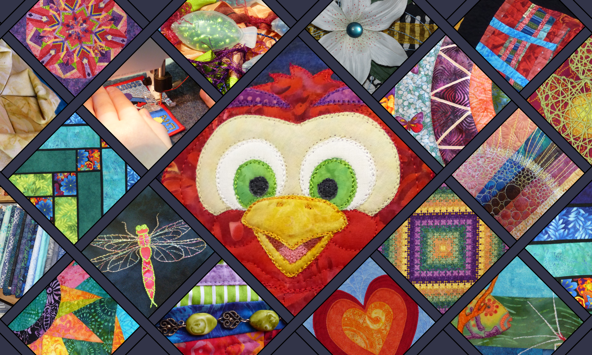
Or find the first 12 Clever Chameleon quilt colour palettes in one place here.

Credit

Today’s photo of majestic nature in blues is from Unsplash.com. Unsplash is a collection of free, high resolution, “do what you want with” photos. Credit is not required, but I love to give credit where credit is due, and am always grateful to people who contribute to open source communities. So I would like you to know that this lovely photo was provided by Jonatan Pie via Unsplash. Be sure to check out his collection of photos on Unsplash.
Jonatan Pie

Clever Chameleon LogoFor colour inspiration for your quilts in your inbox weekly follow along by subscribing to this blog. Or follow Clever Chameleon Quilt Colour Inspiration on Pinterest and pin your favourite colour palettes to try later. 

P.S. If you would like to use Jonatan’s photo or another Colour Inspiration Tuesday photo for your own projects, you can easily find all the Unsplash photos from Colour Inspiration Tuesday in one place for free in my Colour Inspiration Collection.

Colour Inspiration Tuesday: Jewel Tone Triangles

Jewel Tone Triangles color scheme from Clever ChameleonColour Inspiration Tuesday: a free resource of colour combinations to try on your quilts.

Hi – Welcome to another Colour Inspiration Tuesday! When I was first introduced to quilting, the group I met regularly with had a thing about fabrics in rich jewel-tone colours. Specifically, batik collections in saturated turquoise, sapphire, emerald, topaz, magenta and amethyst colours. These were good times, so these colours will always transport me back to the fun afternoons we spent sewing and eating and laughing.

Today’s colour palette was inspired by a photo strong in both geometry and colour. Because the purples, blues and turquoise reminded me of quilts in jewel-tones, we have “Jewel-Tone Triangles”.

Jewel tone triangles colour scheme from Clever Chameleon

Colour Inspiration Tuesday: Jewel Tone Triangles

The “Jewel Tone Triangles” colour palette is amethyst, sapphire and turquoise in several shades of each. These varying shades allow you to create depth, interest and even the optical illusion of 3D by using cleverly placed colour value contrasts.

It is very tempting to sit down and design a triangle quilt (or a tumbling block quilt) in these colours, using the colour transitions in the photo as a muse. I shouldn’t, due to time constraints…..

Of course, I did anyway …….. here is a free layout as an example of how you could use this colour palette (with two additional shades over and above the starting seven Jewel Tones) on a tumbling block quilt.

 Play with it until you find Your perfect combination. I just did!

I’m even tempted to make this quilt….. I could cut the diamonds with my GO! die. My daughter has spotted this post and said “Ooooo, I’d like that on My Bed”.  Not sure that I am going to make it bed-sized, if it happens at all. Perhaps she can aspire to have it on her wall…. I’ll let you know if this one gets to the top of the ideas queue. 

Update, this one is a goer – you can read about the start of the process here.

And read about my progress, including a tutorial on how to sew Y-Seams, here.

Don’t need rich geometry today? Try something more subtle.

There are several gentler colour schemes within the Clever Chameleon collection already….. why not take a look at Lily Pad Glow or Purple Tulip?

Today’s Photo Credit

Today’s stock photo is from Unsplash.com. Unsplash is a collection of free, high resolution, “do what you want with” photos. If you would like to also use this lovely photo, it was provided by Ferdinand Stöhr via Unsplash for license-free usage. Find more of Ferdinand’s photos here:
Ferdinand Stöhr

clever chameleon logoDon’t miss a post – follow along by subscribing to this blog. Or follow Clever Chameleon Quilt Colour Inspiration on Pinterest and pin your favourite colour palettes to try later. 

P.S. For your convenience, I have placed all the Unsplash photos from Colour Inspiration Tuesdays in one place. Find them easily for free in my Colour Inspiration Collection.

Colour Inspiration Tuesday: Knot Dramatic

Knot Dramatic color scheme by Clever ChameleonColour Inspiration Tuesday: a free resource of colour combinations to try on your quilts.

Another Tuesday, another healthy dose of colour inspiration for your quilts! Today we have a really strong colour palette, called “Knot Dramatic”. Inspired by a crisp photo of a coiled rope with beautiful lighting and textures. It is another blue and brown colour scheme, but in cool rather than warm tones like the lovely “Blue Fox” scheme we had a few weeks ago.

Knot Dramatic colour scheme

Colour Inspiration Tuesday: Knot Dramatic

The “Knot Dramatic” colour palette is dark slate grey, gingerbread, coffee, light powder blue, stone blue and aegean blue. It is quite masculine, but would also look wonderful against neutral decor in a living area, or as a throw rug on my dark blue couch.

I think this combination would work best by concentrating on the mid and light tones, using the dark colours more sparingly. There is definitely a risk that too much of the slate grey could dampen the mood of a quilt in the Knot Dramatic colour scheme, but a little would really lift the vibrancy of the rest of the collection. Play with it until you find Your perfect combination!

Purple tulip colour schemeDon’t need a masculine/neutral colour palette today?

There are much softer, warmer palettes to chose from in the Colour Inspiration Tuesday archives. Perhaps you’d prefer “Purple Tulip” in pinks, purples and greens or the gentle pastel confectionery colours of “Lily Pad Glow“.Lily pad glow colour scheme from clever chameleon

Today’s Photo Credit

Today’s stock photo is from Unsplash.com. Unsplash is a collection of free, high resolution, “do what you want with” photos. While there is no obligation for me to tell you where I got this photo, I love to give credit where credit is due. So; this lovely photo was provided by Robert Zunikoff via Unsplash. Robert Zunikoff

Clever Chameleon Logo blue

For colour inspiration in your inbox weekly follow along by subscribing to this blog. Or follow Clever Chameleon Quilt Colour Inspiration on Pinterest and pin your favourite colour palettes to try later. 

P.S. If you would like to use Robert’s photo for your own projects, you can find all the Unsplash photos from Colour Inspiration Tuesday in one place for free in my Colour Inspiration Collection.

Colour Inspiration Tuesday: Lily Pad Glow

Lily Pad Glow color scheme by Clever ChameleonColour Inspiration Tuesday: a free resource of colour combinations to try on your quilts.

Hello – Happy Colour Inspiration Tuesday! Today we have a soft feminine colour scheme for your quilt inspiration, colours that would look lovely on a little girl’s quilt or would suit a lady with quiet, dignified tastes. Introducing “Lily Pad Glow”.

The Lily Pad Glow colour palette was inspired by a pretty pink lily flower. The dark water and the yellowing leaves in the background really highlight the freshness of the flower as it reaches out of the pond. These colours make me think of Spring.

Lily Pad Glow colour scheme palette

Colour Inspiration Tuesday: Lily Pad Glow

The “Lily Pad Glow” colour palette is dark sea green, blue, taffy pink, egg nog yellow, light sage green and light sienna brown. 

Perhaps if I was using this colour palette for a little girl I would drop the sienna and replace it with a bright teal green. Here are the two related palette so you can see what I mean.

Lily pad glow colour scheme with sienna

Lily Pad Glow colour scheme with bright teal green

I would try this palette on a quilt by using most of these colours in fairly equal proportions. This would maintain the fresh, almost confectionary feel of this collection, especially if you used white sashing or background. But if you or your recipient really like pink, you could try concentrating on the warmer pinks/yellows/browns and just use the greens and blues as highlights. Play with it until you find Your perfect combination!

Don’t need girly colours today? Blue fox colour scheme

Perhaps you are looking for something a little more masculine? Try the “Blue Fox” colour scheme instead….

Today’s Photo Credit

Today’s stock photo is from Unsplash.com. Unsplash is a collection of free, high resolution, “do what you want with” photos. While there is no obligation for me to tell you where I got this photo, I love to give credit where credit is due. So, if you would like to also use this lovely photo, it was provided by Ahmed Saffu via Unsplash.

Clever Chameleon logo in light greenDon’t miss a post – follow along by subscribing to this blog. Or follow Clever Chameleon Quilt Colour Inspiration on Pinterest and pin your favourite colour palettes to try later. 

P.S. For your convenience, I have placed all the Unsplash photos from Colour Inspiration Tuesdays in one place. Find them easily for free in my Colour Inspiration Collection.

Colour Inspiration Tuesday: Purple Tulip

Purple Tulip color scheme from Clever ChameleonColour Inspiration Tuesday: a free resource of colour combinations to try on your quilts.

Hi – Happy Tuesday! I love purple and green combinations on quilts….. I haven’t made many so far but I sure do admire them a lot! 

Today’s colour palette was inspired by a stunning photograph of a tulip bathed in light, so I have simply called it “Purple Tulip”.  I think I have found a new favourite – I want to try a colour combination similar to Purple Tulip on a quilt very soon!

Colour Inspiration Tuesday palette Purple Tulip. Teal, plum, dusky rose, midnight blue, cadet blue, rose pink, purple.

Colour Inspiration Tuesday: Purple Tulip

Bonus yellow for purple tulip colour palette.
Add this light yellow to “Purple Tulip” for extra  contrast and highlights.

The “Purple Tulip” colour palette is teal, plum, dusky rose, midnight blue, cadet blue and rose pink. If I had eight colour slots in my colour scheme template I would have added a light yellow. I even tried removing various colours so I could fit light yellow into this palette. But every colour seemed to be needed to keep Purple Tulip true to the feel of the original photo. So, I am giving it to you here as a bonus colour!

I would try this palette on a quilt by using the blues as highlight colours, and the purples, pinks and greens as my main colours. I would also consider adding a dark purple to add more dark contrast to my quilt if I wanted a really dramatic effect. Play with it until you find Your perfect combination!

Don’t like purple and green? Never mind…..Blue fox colour scheme

If you like the blue colours in this palette, but are not into purple and green so much, discover the “Blue Fox” colour scheme instead….

Today’s stock photo is from Unsplash.com. Unsplash is a collection of free, high resolution, “do what you want with” photos. While there is no obligation for me to tell you where I got this photo, I love to give credit where credit is due. So; this lovely photo was provided by Sarah Kothe via Unsplash.

Clever Chameleon logo purple

Don’t miss a post – follow along by subscribing to this blog. Or follow Clever Chameleon Quilt Colour Inspiration on Pinterest and pin your favourite colour palettes to try later. 


P.S. If you would like to use this photo for your own projects, you can find all the Unsplash photos from Colour Inspiration Tuesday in one place for free in my Colour Inspiration Collection.