Colour Inspiration Tuesday – explore with me the endless possibilities of colour for our quilts!
Welcome back to Tuesday! We made it! This past weekend we had a family celebration with my father turning 70, so blogging has had a backseat for a few days. But here we are, on the right day, and more or less on time! Yay!
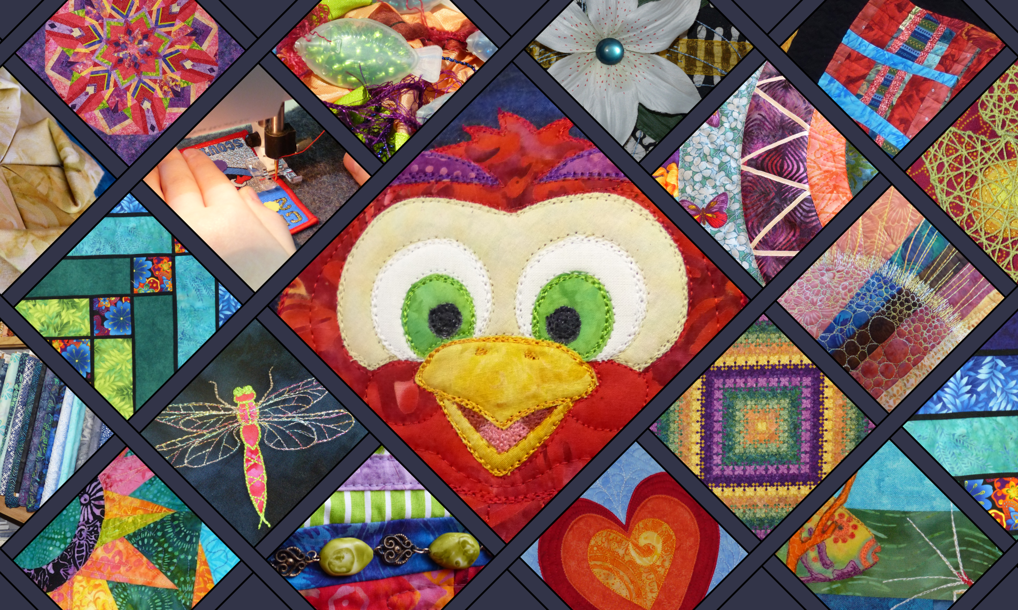
Colour Inspiration Tuesday: Dancing Macaw
About the time I started the Clever Chameleon blog, I also started experimenting with free-motion appliqué. Free-motion appliqué was the homework of my very first Sweet Sixteen monthly meeting. During this time I drew up a number of critters I thought I would like to turn into appliqué designs. One of these fellows was this guy – a cheeky version of a dancing macaw. Macaws are magnificently beautiful, don’t you think?!
Dancing Macaw appliqué design in progress.
Needless to say though, learning to blog has been even more intensive than I expected, and I haven’t yet got back to developing many of the designs into patterns. (Some owls are an exception, more on that another day soon! And I did do a pelican quilt – do you remember him?). Anyway, when I found a photo of a blue and gold macaw on Unsplash.com, I knew I had to do a “Dancing Macaw” colour board.
The “Dancing Macaw” colour scheme is gold and blue. It is a beautiful example of blue and orange-yellow together. You’ll be hard pressed to go wrong with these colours on a quilt because they are complementary and therefore very eye-catching.
The only downside is that the macaw photo doesn’t really capture all the colours that I want to use for my macaw appliqué. So I went back to Unsplash.com and found another photo that makes pulling out the colours I want easier. So, without further ado, here is today’s second colour board: Summer Foliage.
The Summer Foliage colour scheme is blue, gold and green. Between these two new colour boards, I believe I will have no trouble at all putting together a collection of fabrics to appliqué my dancing macaw. What would you use these colours for?! Let us know in the comments below.
Maybe blue and orange is not your favourite complementary colour scheme….
Today’s photos in Dancing Macaw hues are from Unsplash.com. Unsplash is a collection of free, high resolution, “do what you want with” photos. Credit is not required, but I’m sure you’d love to know who is being so generous with their talent. Accordingly, the macaw photo was provided by Andrew Pons and the foliage photograph was taken by Jakob Owens. Be sure to check out their collections of photos on Unsplash.
P.S. If you would like to use Andrew’s or Jakob’s photos or another Colour Inspiration Tuesday photo for your own projects, you can easily find all the Unsplash photos from Colour Inspiration Tuesday in one place for free in my Colour Inspiration Collection.
Colour Inspiration Tuesday(ish): More free colour resources for inspiring your quilts
Welcome to the last post in our Summer Crush Colour Inspiration “Week of Tuesdays”! I hope you have enjoyed exploring how to turn colour mood boards into fabric collections from your favourite fabric store. I certainly have!
Hazy Days colour scheme
Today, as promised, I am exploring not one but two summer photos that I like from Unsplash.com. The first colour board, called “Hazy Days”, captures perfectly the feel of a relentlessly hot day on the beach. What could be more summery than a lifeguard on duty? The second board I am calling “Blood Orange and Mint”. This board comes from a photo of iced water with citrus and mint. It makes me think of refreshing cool drinks and good company, watching a balmy summer evening darken into dusk.
Colour Inspiration Tuesday: Blood Orange and Mint & Hazy Days.
The reason why I have grouped these two photos and their colour palettes into one post is because they are quite related, and have given me very similar end mosaics. Both colour schemes consist of at least one blue, green, turquoise, red-orange and brown colour each. Not the same shades and ratios of each hue, but most definitely representatives from the same set of colour families. Who would have thought? Certainly not I. When I chose these two photos, I was definitely not expecting similar outcomes.
The Blood Orange and Mint Fabric Mosaic
Thanks to Stitched in Color, this week there has been a fun opportunity to use the fabrics available at Quilt Sandwich Fabrics’ Etsy shop to create a collection of nine fabrics that you think capture the theme “Summer Crush”. If you haven’t participated already, there is still time until the 21st August.
Blood orange and Mint colour scheme
To express the colours that I have pulled out of the beverages photograph, I chose the following fabrics. Most of them I chose predominately on colour, but there are a few that I think match the Summer Crush theme in subject as well. Specifically, along the bottom row we have dandelions; a zigzag print that is reminiscent of ocean waves; and …. cameras. Cameras, holidays and summer really are inseparable thoughts, aren’t they?!
Blood Orange and Mint fabric mosaic
The Hazy Days Fabric Mosaic
To capture the colours and feel of the Hazy Days colour palette, I chose tan stripes to represent the colours of the sand. Turned on its side, this fabric could also represent the ripples that form on the beach.
I chose a fabric of graphic squares with a fanned pattern to reflect the spokes of the shade umbrella in the photo. I also emphasised the life saver’s buoy with two fabrics featuring circles and a third with a vivid orange lattice.
The red-orange and turquoise small-print fabrics were chosen to complete the colour way and provide contrast in scale and complexity. Of course, the blue and aqua wave fabric had to be included to represent the ocean. I even rejoiced at the grey of the background in the middle fabric, because it captures the toned-down palette of the original photo. Overall, I think this collection has a good mix of scale and shape contrasts. Love the colours, love the visual texture!
And the fabric I’d love to put on the back? Sailboats, whales, gulls, and waves in cream on a dark teal blue background by Charley Harper for Birch Fabrics. And its even organic cotton! Whoop!
Final thoughts
As you can see, although I started with two entirely different photos and even two quite divergent colour palettes, I have ended up with two mosaics that could be combined without clashing. One fabric even is in both mosaics! If you like either of these fabric combinations, head over to Quilt Sandwich Fabrics and check out the fabrics for yourself.
Summer Crush Mosaic Colour Inspiration Week
If you want to follow my musings around the Summer Crush mosaic contest for the rest of the week, here are the other three days of mosaics:
On Tuesday we looked at the colours of Ice-cream Tones. Pinks and yellows, with a little brown and blue added for interest.
On Wednesday we explored the freshness of the colours seen in ripe pineapples and tropical beaches. Find out why I called this palette “Digging for Pineapples“!
On Thursday we channeled our inner child and played with this fun flamingo. Hot pinks and blue-greens were the order of the day in the bright and happy colours of Flamingoes in the Pool.
Credit
Today’s photos are from Unsplash.com. Unsplash is a collection of free, high resolution, “do what you want with” photos. Credit is not required to use the photos, but I love to give credit where credit is due, and am always grateful to people who contribute to open source communities. So I would like you to know that the Hazy Days photo was provided by Ludde Lorentz via Unsplash, and the cocktails photos was provided by Monika Grabkowska. Be sure to check out their collections of freely gifted photos on Unsplash.com. Ludde Lorentz Monika Grabkowska
For colour inspiration for your quilts in your inbox weekly follow along by subscribing to this blog. Or follow Clever Chameleon Quilt Colour Inspiration on Pinterest and pin your favourite colour palettes to try later.
P.S. If you would like to use any photo featured in Colour Inspiration Tuesday for your own projects, you can easily find all the Unsplash photos from Colour Inspiration Tuesday in one place for free in my Colour Inspiration Collection.
Colour Inspiration Tuesday – Colour Your Mood, Brighten Your World, Design Your Quilt.
Welcome to the third day of our Summer Crush fabric mosaic journey. This week we are looking at matching fabrics to summer-themed photos. The fabrics in question are the current stock of Quilt Sandwich Fabrics on Etsy. The Summer Crush mosaics are inspired by a contest being run by Rachel of the Stitched in Color blog. Genius and fun, all rolled into one idea!
On Tuesday (the real Tuesday) we looked at a colour scheme I called Ice-cream Tones. I ended up with a mosaic of nine fabrics that I think perfectly capture the colours of summer sunshine and berry-flavoured ice-cream.
Yesterday (I know, it was a Wednesday, notTuesday), we looked at the colours of pineapples on the beach. I chose beautiful fresh colours from among all the fabrics at Quilt Sandwich, and shared why pictures of pineapples and beaches have a special meaning for me.
Today (I know…… still not a Tuesday) we are going to explore fabric colours inspired by the most fun photo of the summer pictures I collected from Unsplash.com. I am calling today’s quilt colour scheme “Flamingoes in the Pool”.
Colour Inspiration Tuesday: Flamingoes in the Pool
The “Flamingoes in the Pool” colour scheme is hot pink, slightly-less-hot pink, rose, aqua, teal and pale salmon. These are happy, bright colours; begging you not to take them too seriously. A bit like the Digging for Pineapples palette from yesterday, they are fresh and uncomplicated, and will work as a stand alone palette or as bright patches within large neutral or white spaces.
A detour to “Flamingoes love Ice-cream” colours
To begin with, I struggled to find fabrics in the Quilt Sandwich Fabrics Etsy store to fully express the Flamingoes in the Pool. So, I got distracted with this fabric of bowls of ice-cream sundaes in similar but brighter colours. This fabric in from Robert Kaufman.
Anyhow, I decided to use this fabric as my muse and see what happened when I built a mosaic using these colours.
I am calling this fun mosaic: Flamingoes love Ice-cream!!
I do love this, but it is not what I set out to do…..
Back to “Flamingoes in the Pool”
With a bit more effort I was back on track. Here is my Quilt Sandwich Fabics version of the Flamingoes in the Pool colour scheme.
And here is the fabric mosaic I made….
Flamingoes in the Pool fabric mosaic
Then I decided that while the ice-cream sundae fabric really “isn’t me”…. (I’d totally use them for a child though), I also decided that I really like the lift the yellow fabric gives to the flamingo colour palette. Combining the ideas of Flamingoes like ice-cream and Flamingoes in the Pool, I came up with these two very similar offerings.
These are my new favourites. See how this works? Quilting Your Own Story is a process. Not too many people wake up with a fully formed idea in their head ready to go. Playing with colour and design is a process, an evolution. It happens when you are doing, not when you are waiting for ideas. So you should hop over to Stitched in Color and participate in this contest (or the next contest if you are here reading archived material).
I don’t think I’ll use either of these as my second entry to the Summer Crush mosaic contest though. I have one more idea to pursue tomorrow….
Summer Crush Mosaic Colour Inspiration Week
If you want to follow my thoughts around the Summer Crush mosaic contest for the rest of the week, I will be adding the links here.
On Tuesday we looked at the colours of Ice-cream Tones. Pinks and yellows, with a little brown and blue added for interest.
On Wednesday we looked at the tropical colours of Digging for Pineapples. Orange and yellow and beach colours. Very fresh and refreshing.
Check back tomorrow for my last Summer Crush fabric colour palette ideas. Update: Friday’s mosaic is called Hazy Days. More beach colours, but more sedate than tropical pineapples and flamingoes.
Credit
Today’s photo of the pineapple on the beach is from Unsplash.com. Unsplash is a collection of free, high resolution, “do what you want with” photos. Credit is not required to use the photos, but I love to give credit where credit is due, and am always grateful to people who contribute to open source communities. So I would like you to know that this lovely photo was provided by Vicko Mozara via Unsplash. Be sure to check out his collection of photos on Unsplash.com. Vicko Mozara
For colour inspiration for your quilts in your inbox weekly follow along by subscribing to this blog. Or follow Clever Chameleon Quilt Colour Inspiration on Pinterest and pin your favourite colour palettes to try later.
P.S. If you would like to use Vicko’s photo or another Colour Inspiration Tuesday photo for your own projects, you can easily find all the Unsplash photos from Colour Inspiration Tuesday in one place for free in my Colour Inspiration Collection.
Colour Inspiration Tuesday: Helping you find amazing colours for your next quilt.
Welcome back to Colour Inspiration Tuesday! And an extra warm welcome to you if you have arrived here via the Stitched in Color blog and have joined us at Clever Chameleon for the first time. Here we explore colours with patchwork and quilting specifically in mind, although the colours also work for any other creative project you might be planning of course. This week we are going to have a bumper week. Today we will explore ice-cream tones, later in the week I am planning to investigate the colours of buried pineapples, cocktails at dusk and flamingoes in the swimming pool! Intrigued? I hope so!
Not too long ago I discovered the absolutely beautiful Stitched in Color blog. It resonated with me immediately, especially the colour mosaics you can find here. Rachel writes: “Slow down a minute, my friend, and ponder with me in color.” What a wonderful sentiment. Ever since discovering her page, I have been waiting for a chance to join in the mosaic fun.
One of the reasons why I am so keen to link in with the mosaic contests is because it takes what we do here at Clever Chameleon – choosing a photo, generating colour schemes (or mood boards), and thinking about their uses in a quilt – and moves it into the world of real fabrics. A bit like I did with Jewel Tone Triangles a while back. Today, the fabrics in question are the pretties of the luscious Quilt Sandwich Fabrics shop on Etsy. It makes us work within the confines of what is available today, from one source. This is a helpful skill to practice!
Colour Inspiration Tuesday: Ice-cream Tones
So, back to the matter at hand. Like every other colour palette so far, I have started with an interesting photo from Unsplash.com. This week I focussed on summer-themed photos, and came up with a small short-list of candidates (the contest allows two uploads per participant). To kick us off, we are going to look at ice-cream. Not many things yell summer louder than ice-cream, right?!
The “Ice-cream Tones” colour scheme is yellow, pink and brown. It evokes thoughts of hot days, cold treats and berry flavours. I emphasised the darker pink in my mood board because my favourite summer treat is a frozen yoghurt from the Copenhagen Ice-creamery, which has a dark berry puree swirled through! Delicious!
I would recommend using the dark brown colour as a contrast highlight. Just enough to make the yellows and pinks really shine. I would also add a lot of white to a quilt in these colours, to preserve the clean, light brightness of summer days.
What to create with the Ice-cream Tones colour palette?
Lately, at this point in each post, I have been adding a visual quilt idea or two for you, based around the colours in the day’s colour palette. But that’s where this week is different. Today we will be matching fabrics to our colour palette instead. You can do this with any colour palette and your favourite online fabric store, anytime. Great, isn’t it?!
Firstly, I went through the fabrics on offer at Quilt Sandwich Fabrics, the contest’s sponsors. Here are the fabrics that I initially pulled out.
My first pass at selecting Ice-cream Tones fabrics from Quilt Sandwich Fabrics
Now, the rules of this contest say I have to narrow the selection down to just 9. Which nine would I most like to make a quilt with?!
Here is my process…..
How I chose nine fabrics for an Ice-cream Tones project
My eye was caught by this fabric first – Direction in Yellow, an arrow print on a yellow background, from the Tropical Paradise collection by Josephine Kimberling for Blend Fabrics.
Not only did it capture the colours of the Ice-cream tones palettes, but it also introduced purples for deep summer sunsets, and aquas and blues from the beach and the sky. All things that very much make up summer here in coastal Australia.
To make sure the aqua, blue and purple sit well in my collection I added 2 more prints that use these colours. The bike sign print (From the Ride collection designed by Julia Rothman) was a seriously good find! My hubby and I and the kids cycle a lot, all year round, but especially in summer. And then the feathers (From the Tsuru collection by Rashida Coleman-Hale for Cloud 9 Fabric). I added this fabric because I love it, and because no summer walk around our local wetlands is complete without collecting feathers.
The next step was to make sure there is enough dark contrast and larger scale print in my collection. So I added the pink daisies on the brown background (Daisies and stems in lilac, magenta, olive and lime on a brown background. Designed by Tula Pink for the Acacia collection by Free Spirit Fabrics). Daisies are definitely very summer.
I then went back to my colour scheme and emphasised the main colours with small scale print fabrics. Two pinks and two yellows of different colour values. To finish the collection I added a medium scale medallion print that has both pink and yellows as its main colours. It was designed by Keri Beyer for the Dream A Little Dream With Me collection by In The Beginning Fabrics. The circles remind me of the summer sun, but dreams also seem appropriate for summer.
This is what I ended up with. I hope you like it.
This is my final selection of fabrics for my Summer Crush Mosaic: Ice-cream and Sunshine
What about the backing?
Well it’s not part of the contest, but I saw this little gem along the way. And I can say I would love to have this on the back. It is just too cute!!! And all the right colours too. It is covered in bright houses with a happy attitude and is from Timeless Treasures.
Back to some quick Colour Inspiration Tuesday formalities….
Some information if you are new here today…..
Recently I put together our first colour scheme review. For a good introduction to Colour Inspiration Tuesday, you can find 12 colour palettes all together here.
Last week we looked at classic blues and greens in the Another World Blue colour palette. We also explored what the Cat on a Wall quilt pattern would look like if we used these colours instead of the Sunset Wall palette.
Follow the links to find out what we’ve been up to. And subscribe to emails to keep up to speed from now on!
Credit
Today’s photo of yummy ice-cream is from Unsplash.com. Unsplash is a collection of free, high resolution, “do what you want with” photos. Credit is not required, but I love to give credit where credit is due, and am always grateful to people who contribute to open source communities. So I would like you to know that this lovely photo was provided by Ian Dooley via Unsplash. Be sure to check out his collection of photos on Unsplash.com. ian dooley
For colour inspiration for your quilts in your inbox weekly follow along by subscribing to this blog. Or follow Clever Chameleon Quilt Colour Inspiration on Pinterest and pin your favourite colour palettes to try later.
P.S. If you would like to use Ian’s photo or another Colour Inspiration Tuesday photo for your own projects, you can easily find all the Unsplash photos from Colour Inspiration Tuesday in one place for free in my Colour Inspiration Collection.
Colour Inspiration Tuesday: a free resource of colour combinations to try on your quilts.
Hi – Welcome to another Colour Inspiration Tuesday! Today I have chosen a photo that is really already a quilt idea…. I bet you can see where this is going!
Today’s colour palette was inspired by a photo that is so warm that you can almost feel the reflected heat radiating off the beautiful solid brick wall. Today we are exploring these colours in the palette “Sunset Wall”.
Colour Inspiration Tuesday: Sunset Wall
The “Sunset Wall” colour palette is light lavender, salmon, rose, rust red, orange, dusky purple and dark eggplant. Of course, the bricks are already in a easy to piece layout – either with the light “mortar” sashing, or without.
A simple rendition of Sunset Wall to give a simple quilt design.
This is a very easy design to customise, Add more rows or width of bricks to make the quilt exactly the size you want. Use scraps or yardage to make the bricks. Piece them randomly or according to the layout you want. The less precisely you sew the mortar strips between the bricks, the more rustic your wall will become. Great for a beginner!
Adding extra colours to the Sunset Wall palette adds depth.
I used the “Sunset Wall” colour scheme plus two related colours to design my wall quilt. These were an extra mid-value rose pink and a light orange. Here is my full colour range.
You can also decorate this quilt with appliqué. I was thinking to design a climbing plant or hollyhocks onto mine, when my hubby said it needed a cat on the top.
And for once he is right! hahahaha. So a cat is what it got! I like it. I mustn’t make it though, I am still working on the Jewel Tone Diamonds quilt.
Added some fun to Sunset Wall with a cat!
What would you do with the Sunset Wall colour palette on a quilt? Let me know in the comments below!
These colours too bright? Try using the same colour combination, but in their tones or shades.
Slightly muted Sunset Wall colour palette
Sometimes fabric availability will dictate which shades of colours you can use. Other times you have more luxury of choice. If you are not a “brights” kind of person you might prefer to use a slightly greyed version of this colour palette. This trick works for other colour schemes as well.
Today’s stock photo is from Unsplash.com. Unsplash is a collection of free, high resolution, “do what you want with” photos. If you would like to also use this lovely photo, it was provided by Michal Grosicki via Unsplash for license-free usage. Find more of Michal’s photos here: Michał Grosicki
P.S. For your convenience, I have placed all the Unsplash photos from Colour Inspiration Tuesdays in one place. Find them easily for free in my Colour Inspiration Collection.


 Or you could check out the fun series we had recently – looking at matching colour boards to fabrics to express a variety of summer themes. Start here and follow the links to all five “summer crush” colour boards.
 For more colour inspiration for your quilts, follow along by subscribing to this blog by email (on the sidebar).
 Colour Inspiration Tuesday(ish): More free colour resources for inspiring your quilts


 And the fabric I’d love to put on the back? Sailboats, whales, gulls, and waves in cream on a dark teal blue background by Charley Harper for Birch Fabrics. And its even organic cotton! Whoop!


 For colour inspiration for your quilts in your inbox weekly follow along by subscribing to this blog. Or follow
 Yesterday (I know, it was a Wednesday, notTuesday), we looked at the
  This fabric in from Robert Kaufman.


 For colour inspiration for your quilts in your inbox weekly follow along by subscribing to this blog. Or follow
 One of the reasons why I am so keen to link in with the mosaic contests is because it takes what we do here at Clever Chameleon – choosing a photo, generating colour schemes (or mood boards), and thinking about their uses in a quilt – and moves it into the world of real fabrics. A bit like I did with


 To make sure the aqua, blue and purple sit well in my collection I added 2 more prints that use these colours. The bike sign print (From the Ride collection designed by Julia Rothman) was a seriously good find! My hubby and I and the kids cycle a lot, all year round, but especially in summer. And then the feathers (From the Tsuru collection by Rashida Coleman-Hale for Cloud 9 Fabric). I added this fabric because I love it, and because no summer walk around our local wetlands is complete without collecting feathers.
 I then went back to my colour scheme and emphasised the main colours with small scale print fabrics. Two pinks and two yellows of different colour values. To finish the collection I added a medium scale medallion print that has both pink and yellows as its main colours. It was designed by Keri Beyer for the Dream A Little Dream With Me collection by In The Beginning Fabrics. The circles remind me of the summer sun, but dreams also seem appropriate for summer.


 Last week we looked at classic blues and greens in the
  For colour inspiration for your quilts in your inbox weekly follow along by subscribing to this blog. Or follow


 Don’t miss a post – follow along by subscribing to this blog. Or follow