Colour Inspiration Tuesday: Hoppy Tuesday!

Why sit on a Lily Pad? colour scheme from Clever Chameleon

Colour Inspiration Tuesday – happy, hoppy colours for all your craft projects!!

Welcome back to Colour Inspiration Tuesday! A Hoppy Tuesday!

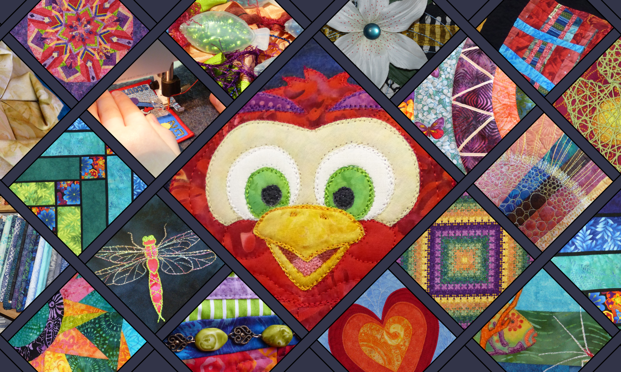
Well! There was a fabulous response to last week’s colour boards. And many of you liked my dancing macaw as well. I shall have to pull my finger out and get that appliqué design under way. However, this week is Royal Show week in Adelaide, so there could be a few distractions. The Gardner-Stephen household is celebrating two craft wins this year. More on that when I have photos.

In the meantime, I have gone with the fun critter theme for a second week because I found a number of fantastic frog photos on Unsplash.com when I was browsing last.

Don’t you just love these little guys:

Frog
Photo by David Clode on Unsplash
Frog
Photo by Wayne Robinson on Unsplash
Frog
Photo by David Clode on Unsplash

Have a guess what my next appliqué creature will be after the macaw?! What? A racoon?! Don’t be daft……. hahahaha. 🙂

Colour Inspiration Tuesday – Hoppy Tuesday

Three frogs, three characters, three colour boards today. 

Hoppy Tuesday colour scheme from Clever Chameleon
Why Sit on a Lily Pad?!

Why Sit on a Lily Pad when you can parade around in the lily flower instead?!

Actually, this frog is probably wondering why he can’t just be left to sit in peace in his tank, being a (pet) tree frog and all. But it’s a cute photo, and the purple colour against the yellow is stunning. And surely there no nicer green than tree frog green, is there? It is so ALIVE.


Hoppy Tuesday colour scheme from Clever Chameleon

The second of my favourite frogs looks more at home in his surroundings. Frog King of All He Surveys. I just love his expression and posture. Probably the colours in this shot are not what I would use for a cheeky frog appliqué, but the rest of the picture is perfect inspiration.

Hoppy Tuesday color scheme from Clever Chameleon

Last up, we have the photo that actually started today’s frog collection. I love the “Hoppy Tuesday” colours of this frog, and the background texture of the wood he is sitting on. I can just see in my mind’s eye a cheeky green frog appliqué on a cushion background made of improv piecing in red, brown, burnt orange and tan fabric scraps. 

For a kid’s frog quilt inspiration you might like this blog post about twin girl and boy frog baby quilts at Lo, Ray and Me. 

Or you can follow along with Sandra Healy’s calendar quilt. August’s block featured a cute frog on a lily pad.

frog appliqué
Sandra Healey’s frog appliqué

Not into frogs? (Really?!) Well, its just gone September, so how about some seasonal suggestions instead?

Lily Pad Glow color scheme from Clever ChameleonIt’s officially spring here in Adelaide now. Not that you’d believe it this week with top temps of 14 and 15°C for the next few days. So in the hope that the sun is coming, I will remind you of another lily colour scheme we had a while ago: Lily Pad Glow.

Autumn Splendour colour scheme from Clever Chameleon


Or if you are in the Northern Hemisphere,  fall is on it’s way….. Try Autumn Splendour for a new take on fall colours.

Credit

I have already covered this to some extent today, but because I really appreciate the talented photographers who generously donate their art to the world without strings attached, I’m going to tell you again. Today’s photos are from Unsplash.com. Unsplash is a collection of free, high resolution, “do what you want with” photos. Credit is not required, but it is totally deserved. So I would like you to know that the photographers featured today are David Clode and Wayne Robinson. Be sure to check out their collections of photos on Unsplash.

david clode

Wayne Robinson

purple clever chameleon logoFor colour inspiration for your quilts in your inbox weekly follow along by subscribing to this blog by email in the side bar. You can also follow my blog on Bloglovin’. Or follow Clever Chameleon Quilt Colour Inspiration on Pinterest and pin your favourite colour palettes to try later. 

I hop 😉 you found some colour inspiration for your projects or the next chapter of your quilt story in among all these beautiful frogs and Hoppy Tuesday colour boards! Have you ever made a frog quilt? Or maybe you keep tree frogs as pets (lucky you). Let us know all about it in the comments below!

P.S. If you would like to use David’s or Wayne’s photos (or another Colour Inspiration Tuesday photo) for your own projects, you can easily find all the Unsplash photos from Colour Inspiration Tuesday in one place for free in my Colour Inspiration Collection.

P.P.S. Linking up this week with Sew Fresh Quilts. Visit for lots of great quilt inspiration in one place.

Colour Inspiration Tuesday: Ice-cream Tones

Ice-cream Tones color scheme by Clever Chameleon

Colour Inspiration Tuesday: Helping you find amazing colours for your next quilt. 

Welcome back to Colour Inspiration Tuesday! And an extra warm welcome to you if you have arrived here via the Stitched in Color blog and have joined us at Clever Chameleon for the first time. Here we explore colours with patchwork and quilting specifically in mind, although the colours also work for any other creative project you might be planning of course. This week we are going to have a bumper week. Today we will explore ice-cream tones, later in the week I am planning to investigate the colours of buried pineapples, cocktails at dusk and flamingoes in the swimming pool! Intrigued? I hope so!

This week we are approaching the exploration of our quilt colours just a little bit differently to usual. Because we are joining in the Stitched in Color’s Summer Crush mosaic contest! Yay!!

Not too long ago I discovered the absolutely beautiful Stitched in Color blog. It resonated with me immediately, especially the colour mosaics you can find here. Rachel writes: “Slow down a minute, my friend, and ponder with me in color.” What a wonderful sentiment. Ever since discovering her page, I have been waiting for a chance to join in the mosaic fun.

One of the reasons why I am so keen to link in with the mosaic contests is because it takes what we do here at Clever Chameleon – choosing a photo, generating colour schemes (or mood boards), and thinking about their uses in a quilt – and moves it into the world of real fabrics. A bit like I did with Jewel Tone Triangles a while back. Today, the fabrics in question are the pretties of the luscious Quilt Sandwich Fabrics shop on Etsy. It makes us work within the confines of what is available today, from one source. This is a helpful skill to practice!

Colour Inspiration Tuesday: Ice-cream Tones

So, back to the matter at hand. Like every other colour palette so far, I have started with an interesting photo from Unsplash.com. This week I focussed on summer-themed photos, and came up with a small short-list of candidates (the contest allows two uploads per participant). To kick us off, we are going to look at ice-cream. Not many things yell summer louder than ice-cream, right?!

The “Ice-cream Tones” colour scheme is yellow, pink and brown. It evokes thoughts of hot days, cold treats and berry flavours. I emphasised the darker pink in my mood board because my favourite summer treat is a frozen yoghurt from the Copenhagen Ice-creamery, which has a dark berry puree swirled through! Delicious!

I would recommend using the dark brown colour as a contrast highlight. Just enough to make the yellows and pinks really shine. I would also add a lot of white to a quilt in these colours, to preserve the clean, light brightness of summer days. 

What to create with the Ice-cream Tones colour palette?

Lately, at this point in each post, I have been adding a visual quilt idea or two for you, based around the colours in  the day’s colour palette. But that’s where this week is different. Today we will be matching fabrics to our colour palette instead. You can do this with any colour palette and your favourite online fabric store, anytime. Great, isn’t it?!

Firstly, I went through the fabrics on offer at Quilt Sandwich Fabrics, the contest’s sponsors. Here are the fabrics that I initially pulled out. 

Ice-cream Tones fabrics first pass
My first pass at selecting Ice-cream Tones fabrics from Quilt Sandwich Fabrics

Now, the rules of this contest say I have to narrow the selection down to just 9. Which nine would I most like to make a quilt with?! 

Here is my process…..

How I chose nine fabrics for an Ice-cream Tones project

My eye was caught by this fabric first – Direction in Yellow, an arrow print on a yellow background, from the Tropical Paradise collection by Josephine Kimberling for Blend Fabrics. 

Not only did it capture the colours of the Ice-cream tones palettes, but it also introduced purples for deep summer sunsets, and aquas and blues from the beach and the sky. All things that very much make up summer here in coastal Australia.

To make sure the aqua, blue and purple sit well in my collection I added 2 more prints that use these colours. The bike sign print (From the Ride collection designed by Julia Rothman) was a seriously good find! My hubby and I and the kids cycle a lot, all year round, but especially in summer. And then the feathers (From the Tsuru collection by Rashida Coleman-Hale for Cloud 9 Fabric). I added this fabric because I love it, and because no summer walk around our local wetlands is complete without collecting feathers.

The next step was to make sure there is enough dark contrast and larger scale print in my collection. So I added the pink daisies on the brown background (Daisies and stems in lilac, magenta, olive and lime on a brown background. Designed by Tula Pink for the Acacia collection by Free Spirit Fabrics). Daisies are definitely very summer.

Ice-cream Tones colour scheme from Clever ChameleonI then went back to my colour scheme and emphasised the main colours with small scale print fabrics. Two pinks and two yellows of different colour values. To finish the collection I added a medium scale medallion print that has both pink and yellows as its main colours. It was designed by Keri Beyer for the Dream A Little Dream With Me collection by In The Beginning Fabrics. The circles remind me of the summer sun, but dreams also seem appropriate for summer.

This is what I ended up with. I hope you like it.

Ice-cream Tones colour scheme fabric selection by Clever Chameleon
This is my final selection of fabrics for my Summer Crush Mosaic: Ice-cream and Sunshine

Ice-cream tones color scheme from Clever Chameleon

What about the backing?

Well it’s not part of the contest, but I saw this little gem along the way. And I can say I would love to have this on the back. It is just too cute!!! And all the right colours too. It is covered in bright houses with a happy attitude and is from Timeless Treasures.

Back to some quick Colour Inspiration Tuesday formalities….

12 color schemes to try on your creative projectsSome information if you are new here today…..

Recently I put together our first colour scheme review. For a good introduction to Colour Inspiration Tuesday, you can find 12 colour palettes all together here.

Last week we looked at classic blues and greens in the Another World Blue colour palette. We also explored what the Cat on a Wall quilt pattern would look like if we used these colours instead of the Sunset Wall palette.

Follow the links to find out what we’ve been up to. And subscribe to emails to keep up to speed from now on!

Credit

Today’s photo of yummy ice-cream is from Unsplash.com. Unsplash is a collection of free, high resolution, “do what you want with” photos. Credit is not required, but I love to give credit where credit is due, and am always grateful to people who contribute to open source communities. So I would like you to know that this lovely photo was provided by Ian Dooley via Unsplash. Be sure to check out his collection of photos on Unsplash.com.
ian dooley

Clever Chameleon logo in brownFor colour inspiration for your quilts in your inbox weekly follow along by subscribing to this blog. Or follow Clever Chameleon Quilt Colour Inspiration on Pinterest and pin your favourite colour palettes to try later. 

P.S. If you would like to use Ian’s photo or another Colour Inspiration Tuesday photo for your own projects, you can easily find all the Unsplash photos from Colour Inspiration Tuesday in one place for free in my Colour Inspiration Collection.

Colour Inspiration Tuesday: Knot Dramatic

Knot Dramatic color scheme by Clever ChameleonColour Inspiration Tuesday: a free resource of colour combinations to try on your quilts.

Another Tuesday, another healthy dose of colour inspiration for your quilts! Today we have a really strong colour palette, called “Knot Dramatic”. Inspired by a crisp photo of a coiled rope with beautiful lighting and textures. It is another blue and brown colour scheme, but in cool rather than warm tones like the lovely “Blue Fox” scheme we had a few weeks ago.

Knot Dramatic colour scheme

Colour Inspiration Tuesday: Knot Dramatic

The “Knot Dramatic” colour palette is dark slate grey, gingerbread, coffee, light powder blue, stone blue and aegean blue. It is quite masculine, but would also look wonderful against neutral decor in a living area, or as a throw rug on my dark blue couch.

I think this combination would work best by concentrating on the mid and light tones, using the dark colours more sparingly. There is definitely a risk that too much of the slate grey could dampen the mood of a quilt in the Knot Dramatic colour scheme, but a little would really lift the vibrancy of the rest of the collection. Play with it until you find Your perfect combination!

Purple tulip colour schemeDon’t need a masculine/neutral colour palette today?

There are much softer, warmer palettes to chose from in the Colour Inspiration Tuesday archives. Perhaps you’d prefer “Purple Tulip” in pinks, purples and greens or the gentle pastel confectionery colours of “Lily Pad Glow“.Lily pad glow colour scheme from clever chameleon

Today’s Photo Credit

Today’s stock photo is from Unsplash.com. Unsplash is a collection of free, high resolution, “do what you want with” photos. While there is no obligation for me to tell you where I got this photo, I love to give credit where credit is due. So; this lovely photo was provided by Robert Zunikoff via Unsplash. Robert Zunikoff

Clever Chameleon Logo blue

For colour inspiration in your inbox weekly follow along by subscribing to this blog. Or follow Clever Chameleon Quilt Colour Inspiration on Pinterest and pin your favourite colour palettes to try later. 

P.S. If you would like to use Robert’s photo for your own projects, you can find all the Unsplash photos from Colour Inspiration Tuesday in one place for free in my Colour Inspiration Collection.

Colour Inspiration Tuesday: Blue Fox

Blue Fox color palette from Clever ChameleonColour Inspiration Tuesday: a free resource of colour combinations to try on your quilts.

It’s Tuesday again already! This week we have a classic colour combination that I think I’ll never tire of. Calming blues with warm browns.  Inspired by a stunning photo of a fox curled up in snow reflecting blue light….. I’m calling this palette “Blue Fox”.

Colour Inspiration Tuesday blue fox palette. light steel blue, cadet blue, grey, dark olive, brown, slate

Colour Inspiration Tuesday: Blue Fox

The “Blue Fox” colour palette is light steel blue, cadet blue, grey, dark olive, brown, mid brown, light slate and dark olive. Use these different colours in different proportions to get the effect you want. If you use a high proportion of blues, you will produce a very calming palette. Alternatively, focusing on the browns with blue highlights will give a very masculine look – maybe just the thing for a quilt for your favourite bloke? Using the two colour families in equal proportions will give a very lovely. mature palette that would look great on the wall or couch. Like always, there are no right or wrong combinations, just the ones you prefer and those you don’t.

Blue and Brown not your thing? That’s ok!

If you like warmer, much redder colours than “Blue Fox”, you may like “Butterfly Loves Red” instead!

Don’t miss your weekly dose of colour inspiration! Follow along by subscribing to this blog. Or you can find lots of colour schemes anytime you like: follow this board from Clever Chameleon on Pinterest

Today’s stock photo is from Unsplash.com. Unsplash is a collection of free, high resolution, “do what you want with” photos. While there is no obligation for me to tell you where I got this photo, I love to give credit where credit is due. So; this lovely photo was provided by Ray Hennessy via Unsplash.

Clever chameleon logo blueJoin me next Tuesday to explore another colour combination possibility for your quilt projects. In the meantime, look around you to find colours similar to Blue Fox in use, and notice whether there are other colours you’d like to add or substitute. Change it to make it truly your own. Remember: choose the colour combination that You like best…… always make sure you are quilting your own story by celebrating your own creativity!

P.S. If you would like to use this photo for your own projects, you can find all the unaltered Unsplash photos from Colour Inspiration Tuesday in one place in my Colour Inspiration Collection.