Colour Inspiration Tuesday: Frosty Berries

Frosty Berries color scheme from Clever ChameleonColour Inspiration Tuesday: a free resource of colour combinations to try on your quilts.

Welcome back to Colour Inspiration Tuesday. Here in Adelaide we are well into winter. We haven’t had near enough rain this year, but today is definitely plenty cold, grey and gloomy enough. What better way to warm up the mood and brighten the day a little than to add a little red?!  So, here is the Frosty Berries winter palette with red for warmth and spectacular effect against icy greys. Enjoy!

Frosty Berries color palette by Clever Chameleon

Colour Inspiration Tuesday: Frosty Berries

The “Frosty Berries” colour palette includes four shades of grey, ranging from dark grey to a cold, lightly greyed blue. These are paired with three magnificent shades of berry red.

I can equally imagine this colour palette being used in strongly masculine geometric quits, bold modern quilts and stunning appliqué designs. This colour palette is very versatile for anyone who likes the combination of cool neutrals or black & white with red. Just vary the amount of red versus the grey. I’m sure you can find your perfect ratio!

Here are some quick and diverse ideas using the Frosty Berries colour scheme.

Frosty Berries colour scheme - modern quilt layout example
A modern Frosty Berries quilt layout favouring the greys


Frosty Berries colour scheme - masculine quilt layout example
A masculine Frosty Berries quilt layout favouring the reds
Frosty Berries colour scheme - flower appliqué quilt layout example
An appliqué flowers Frosty Berries quilt layout
Frosty Berries colour scheme - flower appliqué with leaves quilt layout example
And obviously the same, but with leaves in the mid-red colour

Colour Inspiration Tuesday collection 1Not celebrating winter today?

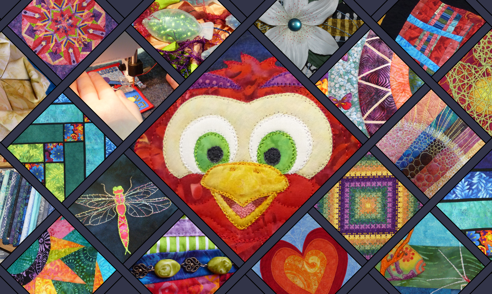
Well, today is pretty exciting because Frosty Berries is the 10th official post in the Clever Chameleon Colour Inspiration Tuesday Series, and the 12th colour scheme to be found among the Clever Chameleon blog posts. So I have put together a post of all the Clever Chameleon colour palettes so far. Have a look and see if anything takes your fancy today! Time to get your imagination on for a new quilt project!

Credit

Today’s photo of Frosty Berries is from Unsplash.com. Unsplash is a collection of free, high resolution, “do what you want with” photos. No credit is demanded, but I love to give credit where credit is due. I am always grateful to people who contribute to open source communities. So I would like you to know that this lovely photo was provided by Maria Mekht via Unsplash. Be sure to check out her collection of photos on Unsplash.
Maria Mekht

For colour inspiration for your quilts in your inbox weekly follow along by subscribing to this blog. Or follow Clever Chameleon Quilt Colour Inspiration on Pinterest and pin your favourite colour palettes to try later. 

P.S. If you would like to use Maria’s photo or another Colour Inspiration Tuesday photo for your own projects, you can easily find all the Unsplash photos from Colour Inspiration Tuesday in one place for free in my Colour Inspiration Collection.

Colour Inspiration Tuesday: Red-Eye Flight

Red Eye-Flight color scheme from Clever ChameleonColour Inspiration Tuesday: a free resource of colour combinations to try on your quilts.

Happy Colour Inspiration Tuesday! Today’s palette is “Red-Eye Flight”, inspired by a stunningly intense stare from a bird of prey. This colour scheme is every bit as powerful as the bird looking at you!

Red-eye Flight Owl Colour Inspiration Tuesday color scheme

Colour Inspiration Tuesday: Red-Eye Flight

The “Red-Eye Flight” colour palette is black, crimson red, stormy grey, limestone grey, pale grey, sienna and fire orange.

These colours lend themselves to a quilt with a strong geometric design. Or take a leaf out of the bird’s book and use the neutral colours for extensive negative space. Then use reds and oranges to piece or appliqué a minimal but vivid design. The result will be a very strong, modern quilt that will be every bit as attention seeking as the inspiration photo.

This colour scheme a bit too strong for the quilt you want to make next? No worries…..

Blue Fox color scheme from Clever ChameleonHow about a colour scheme with a bit less contrast? Try the blues of “Blue Fox” combined with the greys of “Red-Eye Flight”. This will still give you a great neutral palette to work into the background. You can use the more gentle blue colours to feature your design. The inspiration in Colour Inspiration Tuesdays is just the starting point. Come up with your own fantastic design ideas to make a unique quilt and impress your friends!

Credit

Today’s intense photo is from Unsplash.com. Unsplash is a collection of free, high resolution, “do what you want with” photos. I am grateful to people who contribute to open source communities, so I would like you to know that this lovely photo was provided by Massimo Mancini via Unsplash. Visit Massimo’s collection here:
Massimo Mancini

For colour inspiration for your quilts in your inbox weekly follow along by subscribing to this blog. Or follow Clever Chameleon Quilt Colour Inspiration on Pinterest and pin your favourite colour palettes to try later. 

P.S. If you would like to use Massimo’s photo or another Colour Inspiration Tuesday photo for your own projects, you can easily find all the Unsplash photos from Colour Inspiration Tuesday in one place for free in my Colour Inspiration Collection.

Colour Inspiration Tuesday: Autumn Splendour

Autumn Splendour color scheme from Clever ChameleonColour Inspiration Tuesday: a free resource of colour combinations to try on your quilts.

Welcome back to Colour Inspiration Tuesday. Here in Adelaide we are now officially into winter. But summer lingered this year and there are still some wonderful displays of autumn leaves to be seen. Autumn (or Fall) is especially beautiful in the hills surrounding our city. So, I thought that before all the autumn leaves disappear altogether, I had better pay tribute to the beauty around me. Therefore, today’s palette is “Autumn Splendour”.

The photo I have chosen this week for inspiration, has of course, autumn leaves. But in truth it is as much the autumn colours of the background that really captured my imagination.

Autumn splendour colour palette from Colour Inspiration Tuesday

Colour Inspiration Tuesday: Autumn Splendour

The “Autumn Splendour” colour palette is burnt red, orange, coral, dark olive green, light olive green, saddle brown and olive brown.

I can imagine this colour palette being used in a paper pieced maple leaf quilt or a quilt covered in appliqué leaves. Or in blocks made of 2.5″ strips set on the diagonal. It would make a lovely lap quilt in any number of patterns or a wonderful re-interpretation of harvest colours for an original table runner. I’m sure your imagination could run riot with ideas for this colour scheme!

Not ready for Autumn yet? Thinking about Spring instead?

Lily pad glow colour scheme from clever chameleon

Find a little bit of Spring in the Colour Inspiration Tuesday archives with “Lily Pad Glow“. Softer pinks and greens evoke the feeling of growth and gentle warmth that epitomises the best of Spring.

Credit

Today’s photo of autumn splendour is from Unsplash.com. Unsplash is a collection of free, high resolution, “do what you want with” photos. I love to give credit where credit is due, and am always grateful to people who contribute to open source communities. So I would like you to know that this lovely photo was provided by Aaron Burden via Unsplash. Be sure to check out his collection of photos on Unsplash.

Aaron Burden

Olive green Clever Chameleon LogoFor colour inspiration for your quilts in your inbox weekly follow along by subscribing to this blog. Or follow Clever Chameleon Quilt Colour Inspiration on Pinterest and pin your favourite colour palettes to try later. 

P.S. If you would like to use Aaron’s photo or another Colour Inspiration Tuesday photo for your own projects, you can easily find all the Unsplash photos from Colour Inspiration Tuesday in one place for free in my Colour Inspiration Collection.

Colour Inspiration Tuesday is here!! Let’s start with Butterfly Loves Red

Butterfly loves Red color scheme from Clever ChameleonWould you like a free resource of colour combinations to try on your quilts?

Perhaps you have seen a fabulous quilt pattern but you don’t like the colours. Perhaps you do like the pattern’s colours, but the fabrics featured are already out of print (don’t you hate that!!). Or perhaps you just want to try something different to what everyone else is doing…… Colour Inspiration Tuesday is here to help. 

On occasional Tuesdays I will post a photo and a corresponding colour palette using the photo as inspiration. You can follow along by subscribing to my blog. Or you can find all the related posts whenever you like by using the Colour Inspiration Tuesday category tag. 

So let’s get started….. the very first Clever Chameleon Colour Inspiration Tuesday.

Colour Inspiration Tuesday: "Butterfly loves red". Crimson, dark green, tan, slate, brick red, olive.

Colour Inspiration Tuesday: Butterfly Loves Red

The “Butterfly Loves Red” colour palette is crimson, fire brick red, peach, tan, slate, dark slate and dark olive. Use these different colours in different proportions to get the effect you want. Using mostly reds with sparing use of the dark colours for contrast will give you a very vivid, warm looking quilt. Predominately using the more neutral colours with the reds as highlights will give you a modern elegant look. There are no right or wrong combinations, just the ones you prefer and those you don’t.

Today’s stock photo is from Unsplash.com. Unsplash is a collection of free, high resolution, “do what you want with” photos. While there is no obligation for me to tell you where I got this photo thanks to their open community-minded licensing, I love to give credit where credit is due. So; this lovely photo was provided by Tung Minh via Unsplash.

Clever Chameleon logo redI hope you will join me at Colour Inspiration Tuesday to explore new colour combinations you could try in your quilt projects. These suggestions are just the starting point…. have a look in your stash or in your local quilt store to see how you can translate these colours to fabrics. See what you can add or change to make it truly your own. Remember: choose the variation that you like the best…. it’s all about you or your recipient at this stage of the process……make sure you are quilting your own story!

P.S. If you would like to use this photo for your own projects, you can find all the Unsplash photos from Colour Inspiration Tuesday in one place in my Colour Inspiration Collection.